Alca Zagreb - Zvečka Pelinkovac
Roots of Character
The hand-illustrated wormwood becomes a symbol of authenticity, connecting tradition and contemporary design through a distinctive product identity.
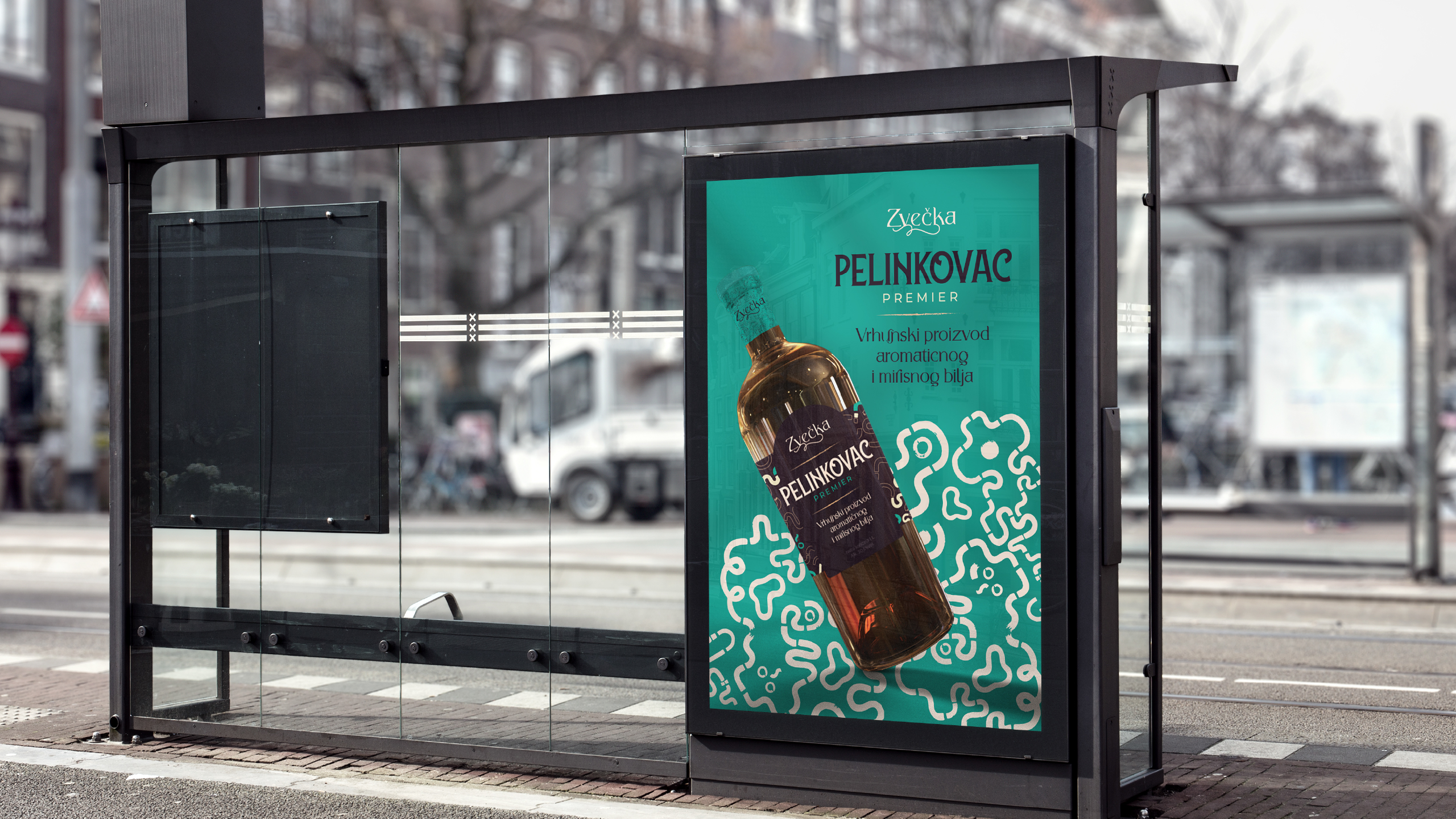
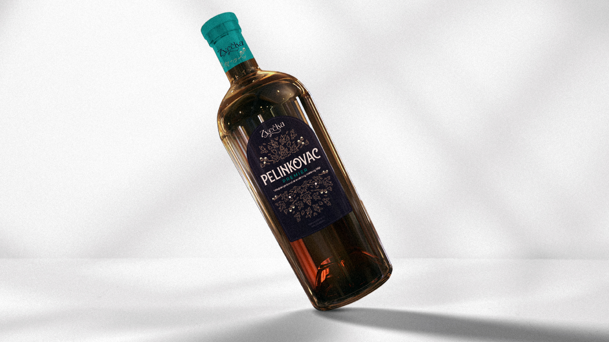
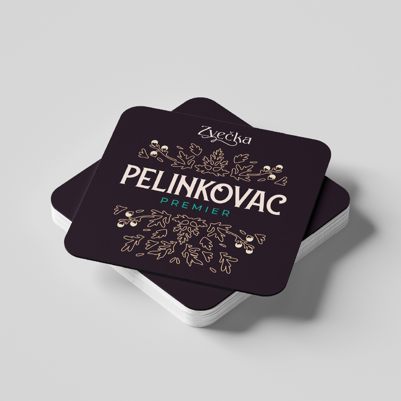
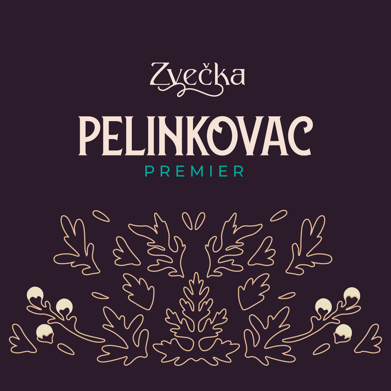
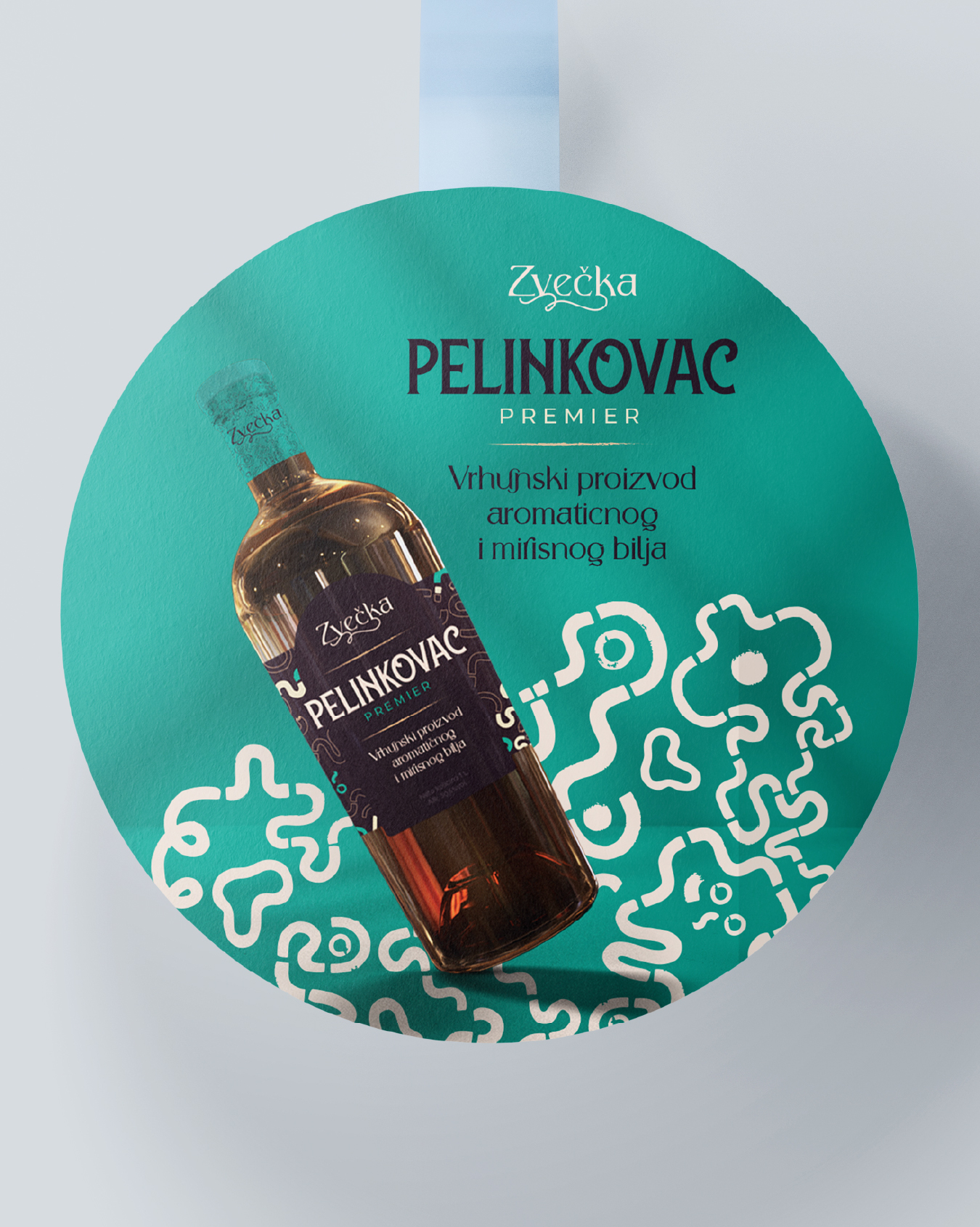
The label design for Zvečka Pelinkovac was developed as a bespoke visual solution that clearly stands apart from conventional approaches within the category. At the heart of the identity is a hand-illustrated depiction of the wormwood plant, created exclusively for this product line. Rather than relying on generic graphic elements, a unique illustration was crafted to emphasize authenticity, quality, and the connection to the key ingredient that defines the character of Pelinkovac.
Our approach and methodology
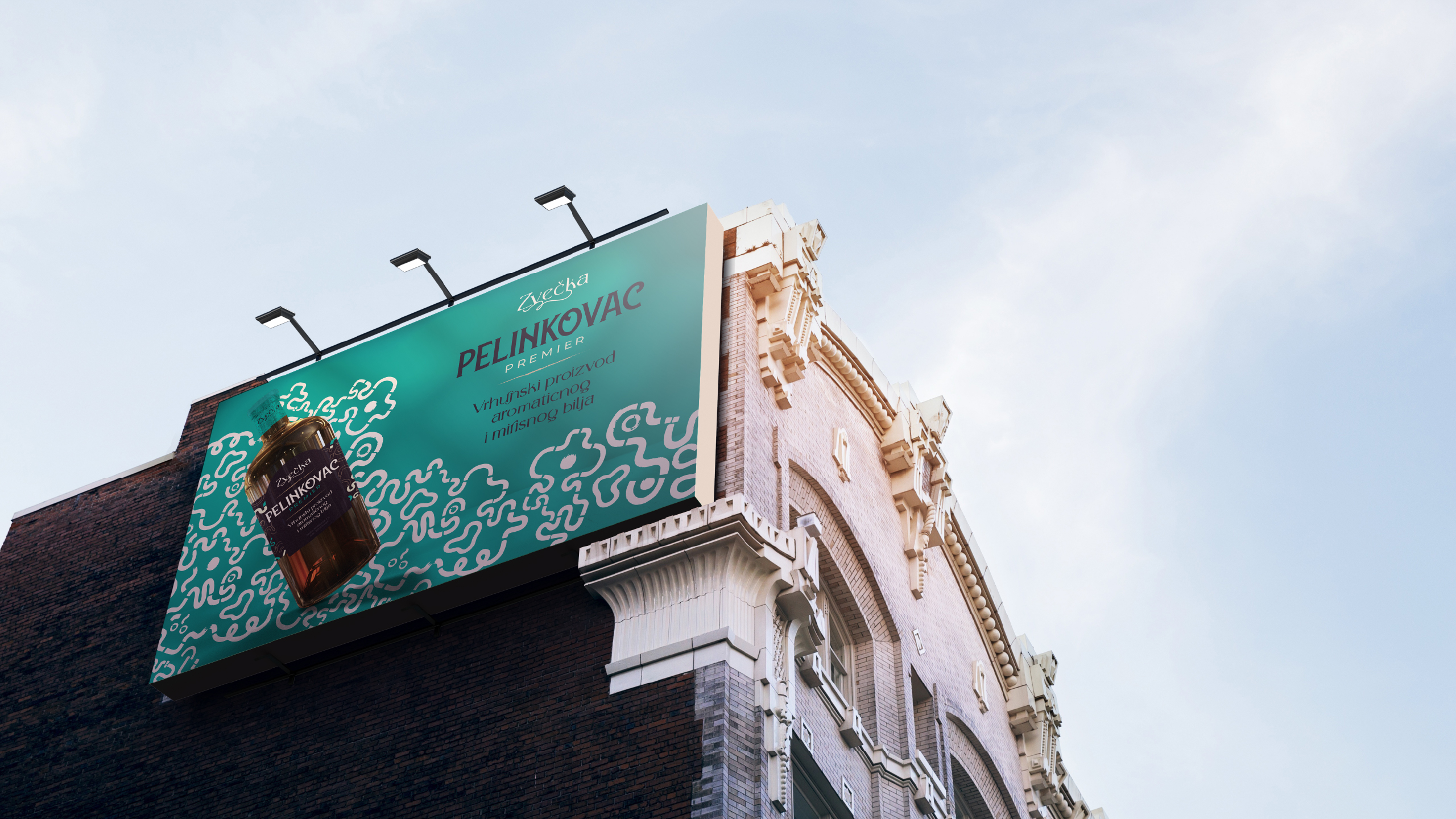
The visual concept is built on the fusion of tradition and contemporary design. The detailed illustration of wormwood conveys a sense of craftsmanship, natural origin, and a rich herbal recipe, while the typography and layout ensure a modern appearance and strong shelf visibility. The illustration serves not only as a decorative element but also as the primary storyteller, communicating the product’s heritage and core values.
Through this illustrative approach, the label creates an emotional connection with consumers while contributing to a more premium perception of the product. The result is a distinctive visual identity that differentiates the brand within the category, appeals to a younger urban audience, and supports its desired market positioning. A carefully structured information hierarchy enables quick product recognition, while the wormwood illustration becomes a key communication asset and a lasting symbol of the new product line.
Through this illustrative approach, the label creates an emotional connection with consumers while contributing to a more premium perception of the product. The result is a distinctive visual identity that differentiates the brand within the category, appeals to a younger urban audience, and supports its desired market positioning. A carefully structured information hierarchy enables quick product recognition, while the wormwood illustration becomes a key communication asset and a lasting symbol of the new product line.